


A new identity for the future of experiences
When we started redesigning CaptainBook's identity, the goal was not simply to create a new logo, it was to capture the evolution of the company.
CaptainBook began with a clear connection to the sea and the people who create unforgettable experiences, but its ambition has always been much broader: to become the technology that powers the experience economy.
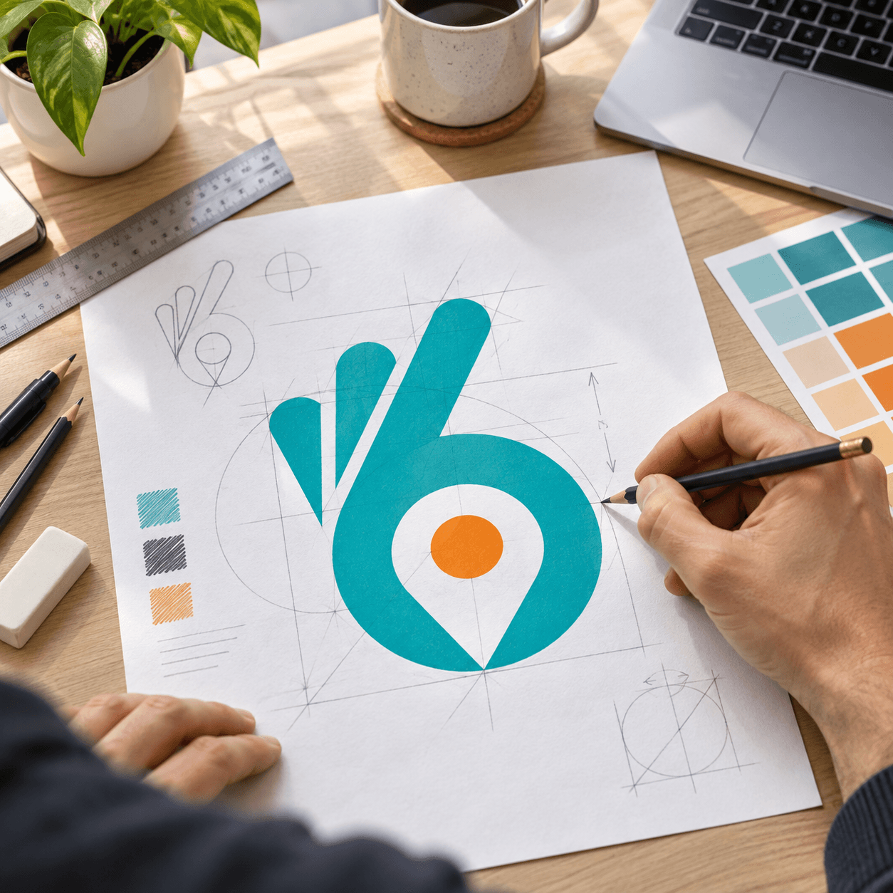
The new symbol brings together several ideas at the heart of the brand: navigation, discovery, connection, and confidence.
The lowercase "b" represents booking at the core of the platform, while the integrated location marker reflects the moment where technology meets the real world, helping travellers discover places, activities, and moments worth remembering.
Look closer, and the symbol reveals another subtle meaning: the familiar gesture of "OK". A small reminder of what CaptainBook is built to deliver for operators every day: confidence, control, and the assurance that everything is running smoothly.
The colour palette balances trust and energy. The deep tones communicate reliability and professionalism, while turquoise reflects the world of travel, water, and exploration. The orange accent acts as a signal of action and momentum, reflecting the energy of operators building their businesses.
The new wordmark keeps the brand approachable and human. CaptainBook is not just software; it is a partner for operators who bring people together through memorable experiences.
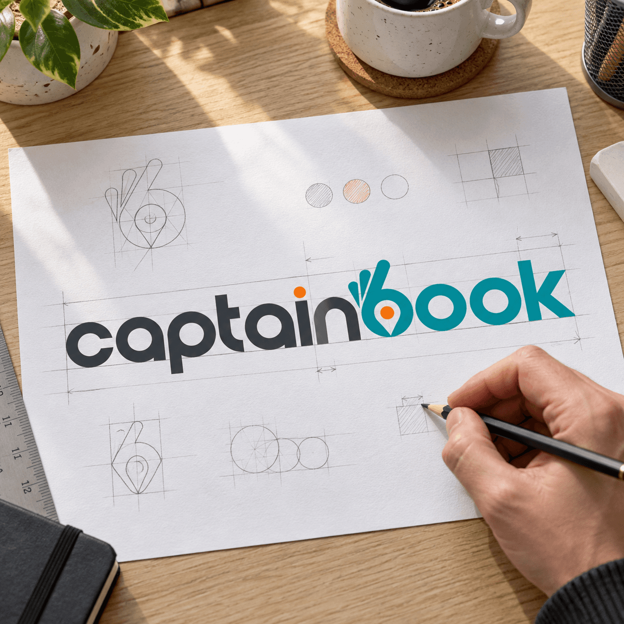
This identity represents a shift from a booking tool into a global technology platform, one that helps experience providers take control of their operations, connect with more travellers, and navigate the future of tourism.
A new chapter for CaptainBook. A stronger symbol for everything ahead.